Archetype Consulting
February 2021 to present — Director, Analytics & Digital Transformation
Analytics strategy and solution architecture for enterprise clients. Designs the solution, then builds it.

Data tools and platforms I've designed and built
Professional credentials and continuous learning
I work where data reaches the people who act on it.
Most organizations aren't short on data. They're short on direction. I know because I spent the first part of my career on the other side of the table, in pricing and marketing analytics. I was the stakeholder that BI teams and consultants build for.
What changed my trajectory was realizing I didn't have to wait for someone else to build it. Tableau was the first tool that let me close that gap myself. I've been closing it ever since, with whatever the work calls for.
Clients bring the business challenge; that's why they hired the firm. I turn it into a design, then build it. Sometimes the answer is a data model. Sometimes it's a platform recommendation. Lately it's been custom software and analytics applications that didn't exist before.
February 2021 to present — Director, Analytics & Digital Transformation
Analytics strategy and solution architecture for enterprise clients. Designs the solution, then builds it.
April 2018 to November 2018 — BI Developer / Consultant (contract)
Evaluated Power BI, Spotfire, and Tableau against defined requirements for an oil and gas client, then built production dashboards on the recommendation.
July 2015 to February 2021 — Retail Analyst, Business Intelligence Developer, Market Pricing Manager, Manager, Sales Planning and Analytics
Defined the standards and architecture for self-service analytics across business divisions, and built dashboards embedded in the Salesforce Community Portal for external customers.
August 2014 to July 2015 — Pricing Optimization Senior Analyst
Rebuilt the cigarette cost increase model in PowerPivot, parameterizing the inputs so pricing scenarios ran on demand instead of being rebuilt for every cost change.
August 2013 to July 2014 — Assistant Pricing Manager
Managed pricing processes, strategies, and systems for a manufacturer.
January 2007 to August 2013 — Marketing Database Manager, Pricing Manager
Pricing and marketing analytics for a wholesale distributor. Absorbed the pricing manager function after a layoff while keeping the database role.
May 2002 to October 2006 — Supervisor, Client Services
Started in data entry and ended designing test cases and writing assessments for product-fit and SKU velocity studies.
Twelve years of global earthquakes in a browser tab: 86,000 events queried client-side, with the live USGS feed merged in on a 60-second poll
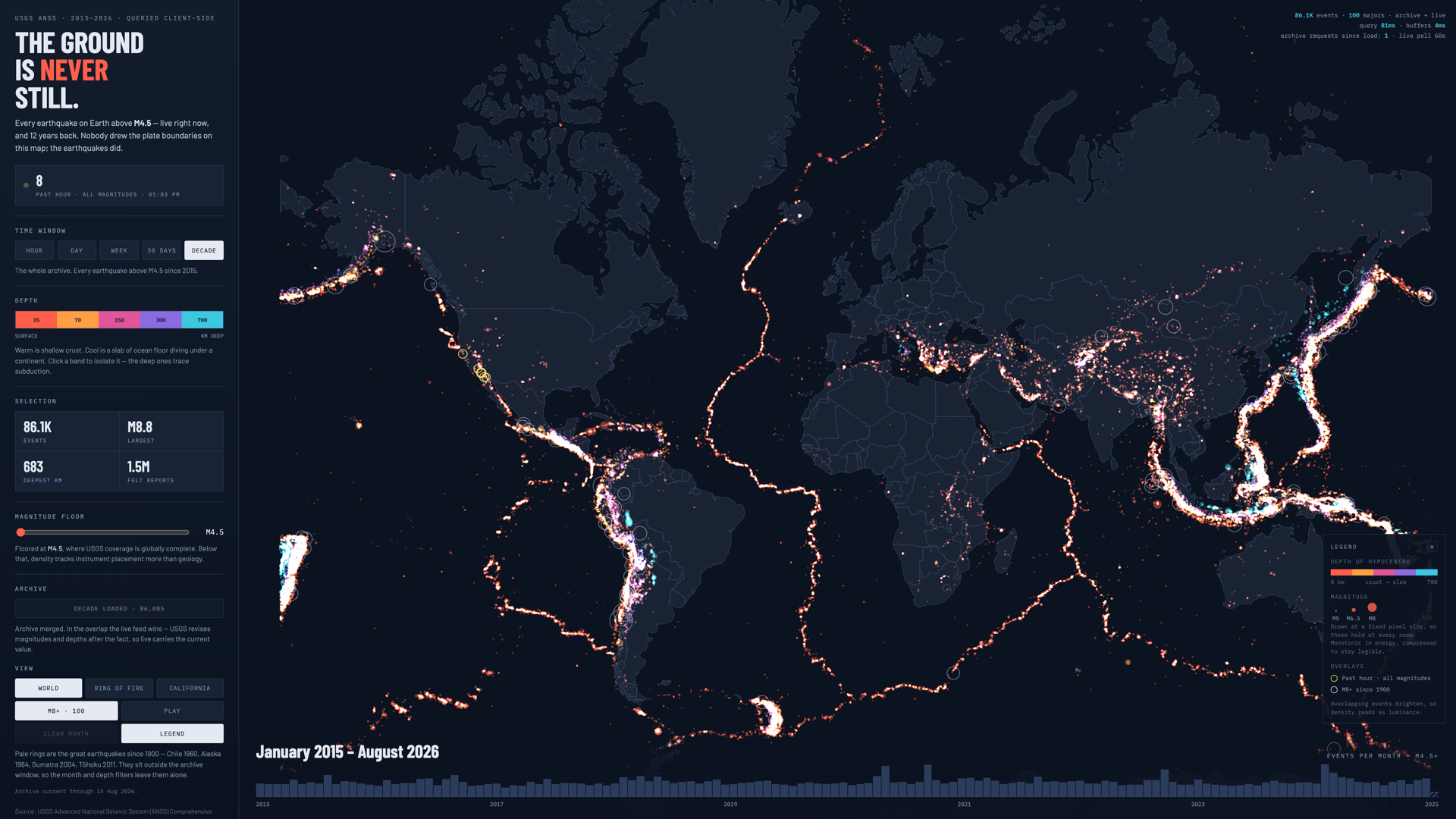
Tools: DuckDB-WASM, deck.gl, Apache Arrow, Parquet, JavaScript, Python, GitHub Actions, Netlify
Tremor puts every earthquake on Earth above magnitude 4.5 on one map. The live feed right now, plus the archive going back to 2015. All of the querying happens in the browser. A 3.1 MB Parquet file gets fetched once and handed to DuckDB-WASM. deck.gl renders the result on the GPU. There's no API, no warehouse, and no query server behind any of it, so filtering a decade of seismicity by month, depth band, or magnitude floor takes tens of milliseconds against local memory. Depth is the color axis. Shallow crustal events run warm and the deep ones trace subducting slabs in cyan, so the shape of a subduction zone falls out of the data instead of getting drawn on top of it. Nobody plotted the plate boundaries on this map. The earthquakes did.
Two problems, and they pull against each other. The first is volume. 86,000 points is enough that the obvious approach, handing deck.gl an array of objects, locks the tab. It's also enough that painting them all at full opacity saturates the Ring of Fire into a solid stroke that hides both the coastline and the depth encoding. The second is freshness. An archive baked into a static file is stale the moment it ships. But earthquakes are the case where a visitor genuinely expects to see what happened an hour ago, and a dashboard with no server has nowhere to go and ask.
The archive never touches an object array. Arrow columns come out of DuckDB as typed arrays and go straight into interleaved GPU buffers. That's the difference between a locked tab and a query that returns in about 65ms, with the buffer rebuild costing another 5ms. Overplotting is handled by drawing the points additively and sorting by depth descending. Overlapping events brighten instead of stacking opaquely, so density reads as luminance, the basemap survives underneath, and deep events land on top of the shallow 90% that would otherwise bury them. Radius scales with energy rather than magnitude, since seismic energy goes as 10^1.5M and a linear ramp badly undersells the big ones. Freshness is a merge, not a rebuild. The page opens on the last 30 days from the USGS live feed and only fetches the decade archive when you ask for it, so first paint costs a few hundred KB instead of 3.1 MB. Where the live window and the archive overlap, live wins. USGS revises magnitudes and depths after the fact, so the newer read is the correct one. A GitHub Action rebuilds the Parquet weekly and keeps three dated builds. The manifest that names the current file is served no-cache while the Parquets themselves stay immutable for a year, so a browser holding a stale manifest still resolves to a file that exists.
86,085 events and 1,583 great earthquakes back to 1900, served as static files from a CDN. Filtering the full decade by month, depth, or magnitude returns in roughly 65ms, with one network request for the archive and none after that. The running cost is static hosting. No per-seat license, no compute meter. It's a working argument for a pattern I keep coming back to. For public-facing analytics over data that doesn't need row-level security, the query engine belongs in the browser.
Desktop IDE for Tableau workbooks: formula editing, dependency graphs, and AI documentation
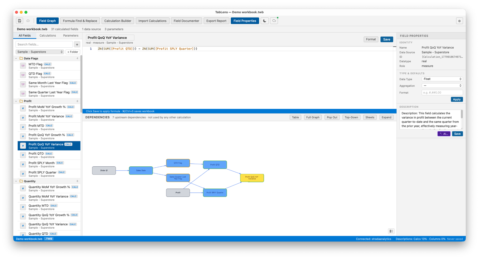
Tools: Tauri v2, Rust, Svelte, Python, Monaco, Cytoscape.js
Award: 2nd Place, Tableau Conference 2026 Hackathon
A native desktop application that turns Tableau workbook maintenance into an engineered workflow. Open any .twb, .twbx, .tds, or .tdsx file locally, or connect straight to Tableau Cloud and skip the download/upload cycle entirely. Includes a Monaco formula editor covering all 182 Tableau functions with real-time validation, an interactive Cytoscape.js dependency graph, a Time Intelligence Builder with fiscal calendar support, cross-workbook calculation import, and a 4-step bulk AI documentation wizard. Built on Tauri v2 (Rust) with a Svelte frontend and Python sidecar, fully supported on macOS (Apple Silicon + Intel) and Windows.
Tableau's native editor provides no way to visualize calculation dependencies, identify unused fields, or document an entire workbook at scale. Complex workbooks with dozens of calculated fields become impossible to audit or hand off.
Built a Tauri + Rust + Svelte desktop app that parses Tableau XML directly. The Monaco formula editor covers all 182 Tableau functions with autocomplete and signature help, and validates in real time, including nested aggregate detection through calculated field references, with proper LOD scope handling. Cross-workbook import opens a second workbook read-only and resolves a selected field's full upstream dependency chain automatically, handling name conflicts and datasource mapping. Tableau Cloud integration connects via Personal Access Token stored in the OS keychain: browse the project hierarchy, open a workbook, edit, publish back. Also included: a Cytoscape.js dependency graph, a Time Intelligence Builder with fiscal calendar arithmetic and auto-variance generation, a health scanner with six performance rules, formula find-and-replace with preview, markdown export scoped to workbook or worksheet, timestamped backups on every save, and a bulk AI documentation wizard supporting Anthropic and OpenAI.
2nd place at the Tableau Conference 2026 Hackathon. Development began March 2, 2026 and TabLens was submitted that April. Now at v11.2.0 across 16 releases, with Tableau Cloud integration, cross-workbook calculation import, and a formula validator covering all 182 Tableau functions. Reduces workbook documentation and audit from hours to minutes.
Self-hosted migration platform for Tableau Server to Cloud: audit, rationalize, and execute with full dependency ordering
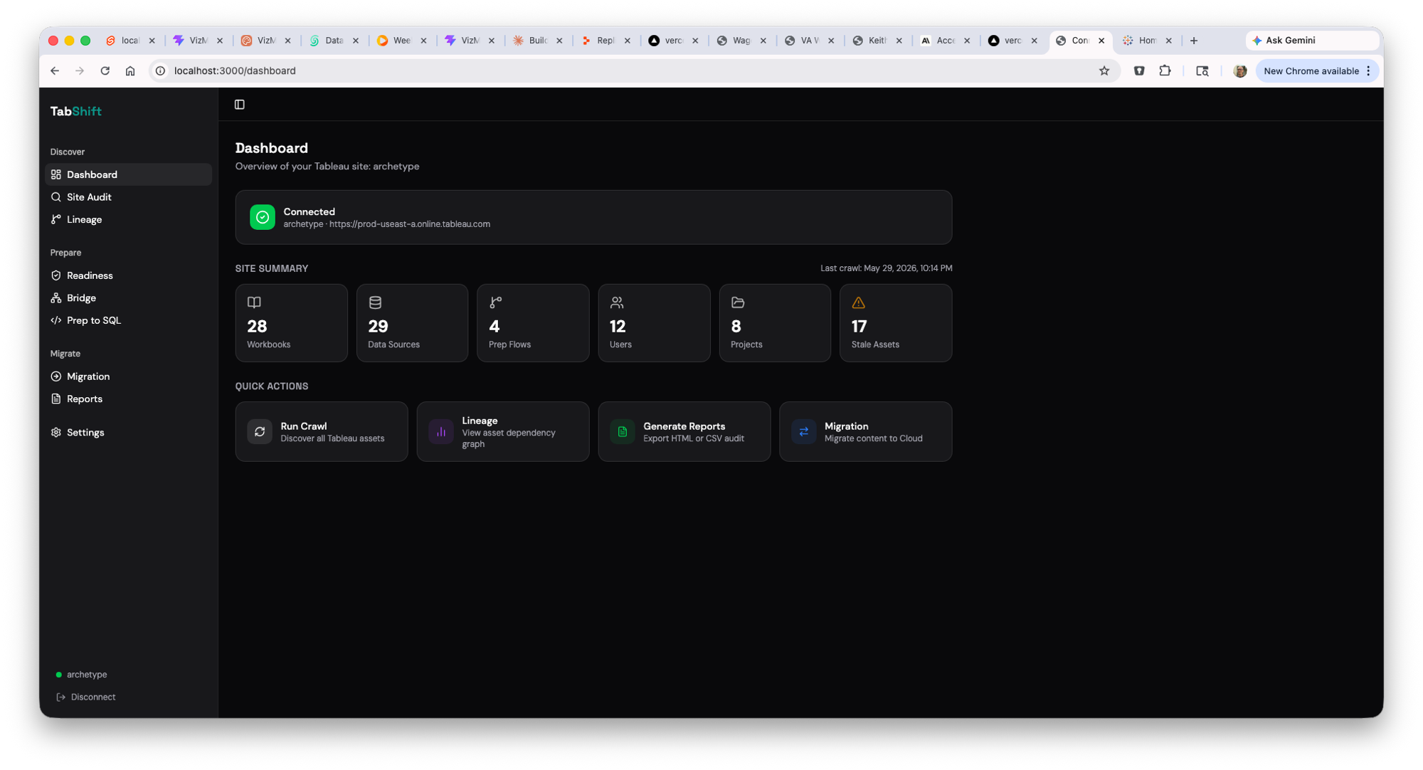
Tools: SvelteKit, FastAPI, Python, Docker, SQLite
A self-hosted Docker application that takes organizations from Tableau Server audit to completed Cloud migration in a single platform. Runs entirely inside the customer network, so no data leaves. Built with a SvelteKit frontend, FastAPI backend, and SQLite state store, with live SSE progress streaming and checkpoint/resume surviving container restarts. Shares a Python XML parsing core with TabLens: same engine, different scale.
Migrating from Tableau Server to Tableau Cloud is not a lift-and-shift. Organizations have years of accumulated workbooks, undocumented Prep flows, and permissions that have grown organically, with no reliable inventory, no dependency visibility, and no governance tooling.
Full REST API crawl of all site assets with real-time SSE progress and checkpoint/resume. 5-dimension asset scoring generates a 0–100 composite score with Migrate / Review / Retire recommendations and written rationale per asset. Full lineage graph built without a paid Catalog license. Dependency-ordered migration execution automatically patches workbook XML to repoint data source references. Includes a Prep flow parser that translates .tflow XML into Snowflake CTE chains (8 step types) with HIGH/MEDIUM/LOW confidence scoring and Jaccard-based redundancy detection. Air-gapped tarball for public sector environments.
Covers the entire migration lifecycle (audit, scoring, lineage, Bridge planning, migration execution, post-migration validation, and stakeholder reporting) in a single self-contained platform. Five HTML reports with custom organization branding for consultant delivery.
Content lifecycle management for Tableau Cloud: promote workbooks across Dev and Prod with semantic diffs and a one-click workflow
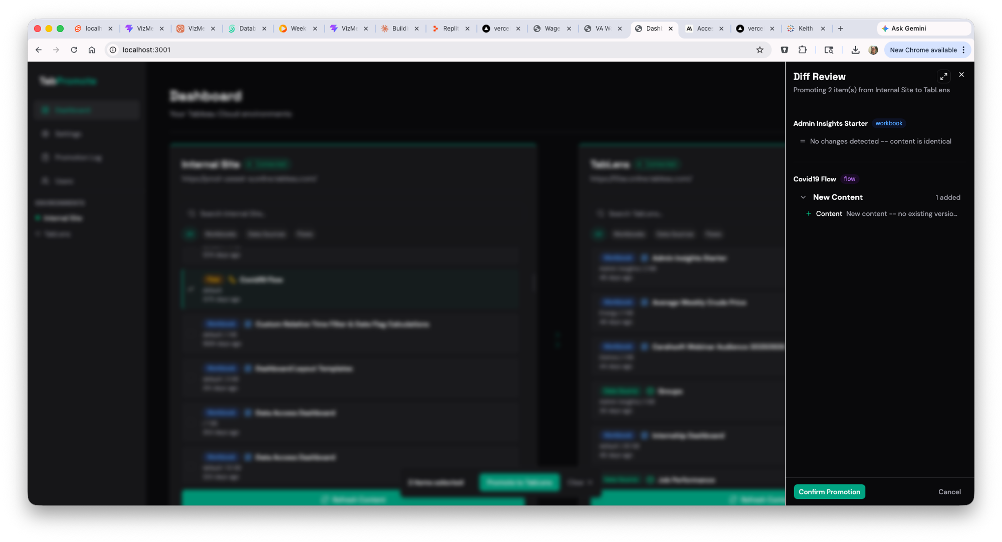
Tools: SvelteKit, FastAPI, PostgreSQL, Docker
A self-hosted platform for managing the Tableau Cloud Dev-to-Prod promotion workflow. Built for organizations using Tableau Cloud's multi-site Advanced Management setup: BI developers iterate on Dev, and the Center of Excellence reviews and promotes to Prod in a few clicks. PostgreSQL backend for multi-user access with credentials encrypted at rest.
Tableau Cloud's multi-site environment separation (Dev/Prod) has no built-in promotion workflow. Teams manually download from the source site and re-upload to the destination, across dozens of workbooks, per release cycle. No diff, no review gate, no audit trail of what was promoted or by whom.
Three-column dashboard shows all configured Tableau Cloud sites side by side. Before promoting, displays a semantic diff summarizing changes to calculated fields, parameters, filters, worksheets, and dashboards since the last published version. Optional side-by-side XML view with synced scrolling. One-click promotion via Tableau REST API with configurable approval gates for COE workflows. Role-based access (Admin / Promoter) with a full promotion log recording content name, destination, user, and timestamp.
Eliminates the manual download/re-upload cycle entirely. COE teams see exactly what changed before promoting, with a complete, timestamped audit trail of every promotion across all sites.
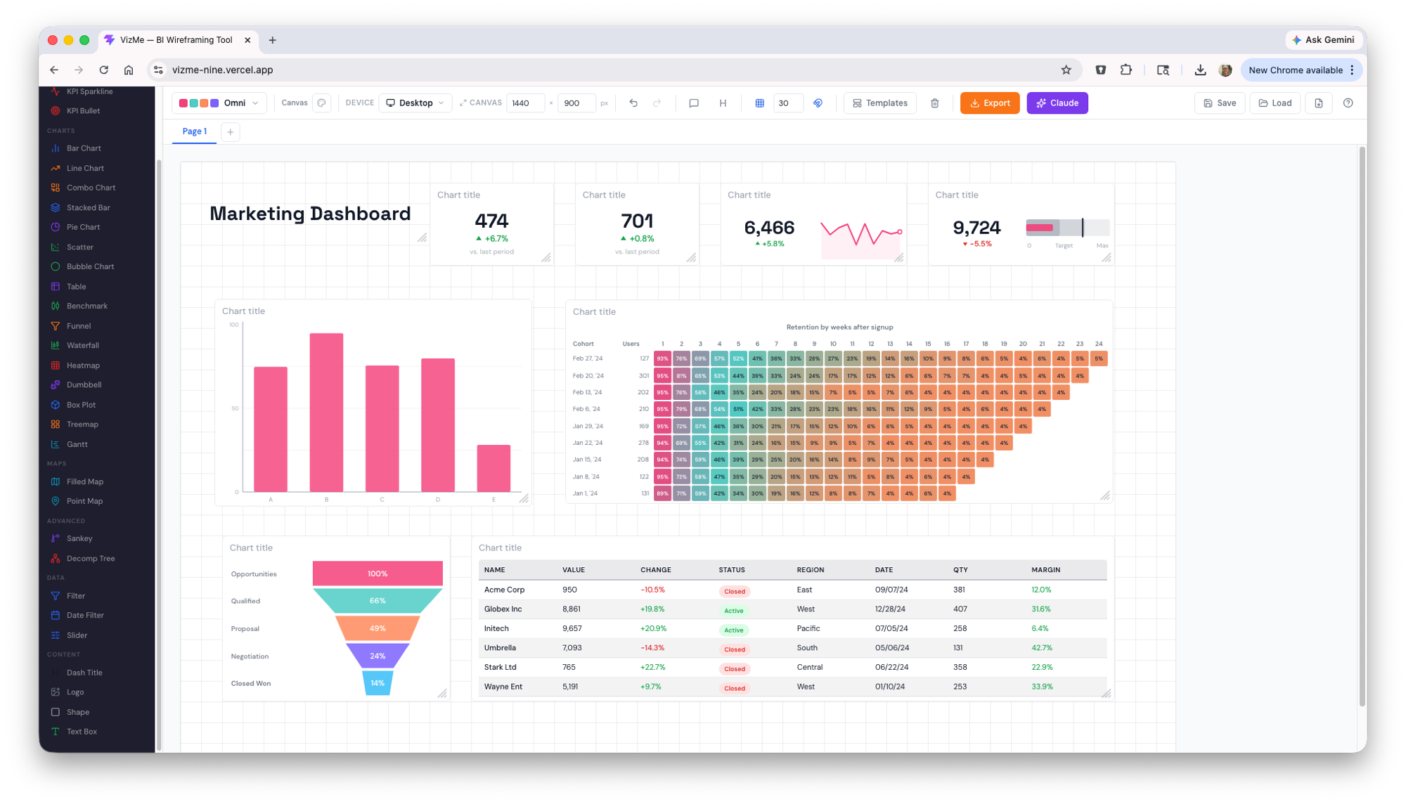
Browser-based wireframing for BI developers: mock up dashboards that look like Tableau, Power BI, or Sigma
Tools: React, TypeScript, Tailwind, Zustand, MCP
A browser-based wireframing tool where picking a skin (Tableau, Power BI, Sigma) re-shells the entire canvas to match that tool's chrome, fonts, and color palette. 15+ BI-specific widgets including bar, line, scatter, KPI tiles, filters, tables, Sankey, decomp tree, and maps. Multi-page projects with tab navigation, PNG/PDF export with editor UI stripped. Backed by a VizMe MCP server that exposes the live wireframe to Claude.ai via Model Context Protocol: click "Open in Claude" and Claude reads your wireframe directly, no copy-paste required.
Generic wireframing tools (Figma, Miro) force BI work into boxes. When stakeholders see a Figma mockup of a "Tableau dashboard," they see Figma, not Tableau. Discovery sessions stall on aesthetics instead of layout and content decisions.
React + Zustand app with a skin system that re-shells the entire canvas per BI tool: Tableau's gray nav and blue accents, Power BI's dark header, Sigma's snap-to-grid layout. Added a MCP server (TypeScript on Vercel, Vercel KV for per-user state, Clerk auth) so users click "Open in Claude" and Claude reads the live wireframe through the Model Context Protocol, enabling design critiques, layout polish, or generation of a real .twbx Tableau workbook. Multi-user from day one with per-userId state keying and an append-only Zod-validated schema.
One of the first purpose-built BI tools with native MCP integration. Live wireframe-to-Claude handoff with no copy-paste or prompt engineering required. .twbx Tableau workbook generation validated against Tableau Desktop 2026.1.
Tableau Viz Extension that breaks a metric down by its contributing attributes to surface root cause
Tools: Svelte, D3.js, Tableau
A Tableau Viz Extension that brings decomposition-tree analysis natively into Tableau dashboards. Pick a measure and progressively break it down by one dimension after another, and the tree expands to show how each attribute contributes to the total, so you can drill from a headline number straight to the segments driving it. Built with Svelte and D3.js on the Tableau Extensions API.
Tableau has no native decomposition tree: the Power BI-style "what's driving this number" visual. Analysts tracing a metric to its root cause have to build manual drill paths or rebuild the same nested breakdowns by hand for every question.
Built a Tableau Viz Extension with a Svelte frontend and a D3.js-rendered tree. Users pick a measure and add the dimensions to decompose by; the extension reads the worksheet data and renders an interactive, expandable tree where each node shows its share of its parent. Clicking a branch drills further, following the largest contributors down to the root cause.
Brings Power BI-style decomposition-tree and root-cause analysis into Tableau without leaving the dashboard, and is reusable across any measure-and-dimension combination.
Snowflake data profiling & quality workbench: profile a table or whole schema, score quality, infer keys, and generate non-destructive fix SQL
Tools: React, FastAPI, Snowpark Container Services, Docker, Cortex
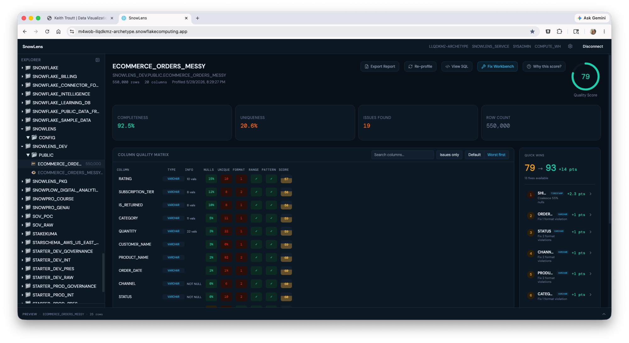
A data profiling and quality workbench that runs entirely inside Snowflake as a Snowpark Container Services app. Profile a single table or an entire schema in one pass, review column-level quality metrics across six dimensions, infer primary/foreign keys, generate non-destructive fix SQL, and export client-ready HTML/PDF reports with ER diagrams, all from the browser. Built for the Snowflake Native App Marketplace and as a consulting accelerator for client data discovery.
Data discovery on Snowflake is slow and manual: analysts write ad-hoc SQL to check null rates, formats, and key relationships table by table, with no consistent quality scoring and no client-ready output. And any cleanup risks mutating the source data it's meant to assess.
Built a Snowpark Container Services app (React + Vite frontend, FastAPI backend, NGINX router) that profiles a table, or an entire schema, in a single type-aware SQL pass. It scores every column across six quality dimensions, auto-detects primary and foreign keys (including composite) with confidence tiers, parses view DDL into a lineage graph with transitive risk, and surfaces Cortex LLM recommendations per column. A fix workbench previews the combined SQL live and executes it into clean Views, Materialized Views, or Dynamic Tables, never touching source tables. RBAC-aware throughout, so read-only users can view and copy SQL but not execute.
Turns multi-day client data discovery into a single browser session, with branded HTML/PDF and client-ready Markdown reports (embedded Mermaid ER diagrams) ready for delivery. Non-destructive by design and RBAC-aware, and packaged for the Snowflake Native App Marketplace.
An interactive map that solves the bike-share rebalancing problem using real Citi Bike data, with a routing optimizer built from scratch
Tools: DuckDB-Wasm, deck.gl, MapLibre GL, JavaScript, Python, Parquet, Vite, Vercel
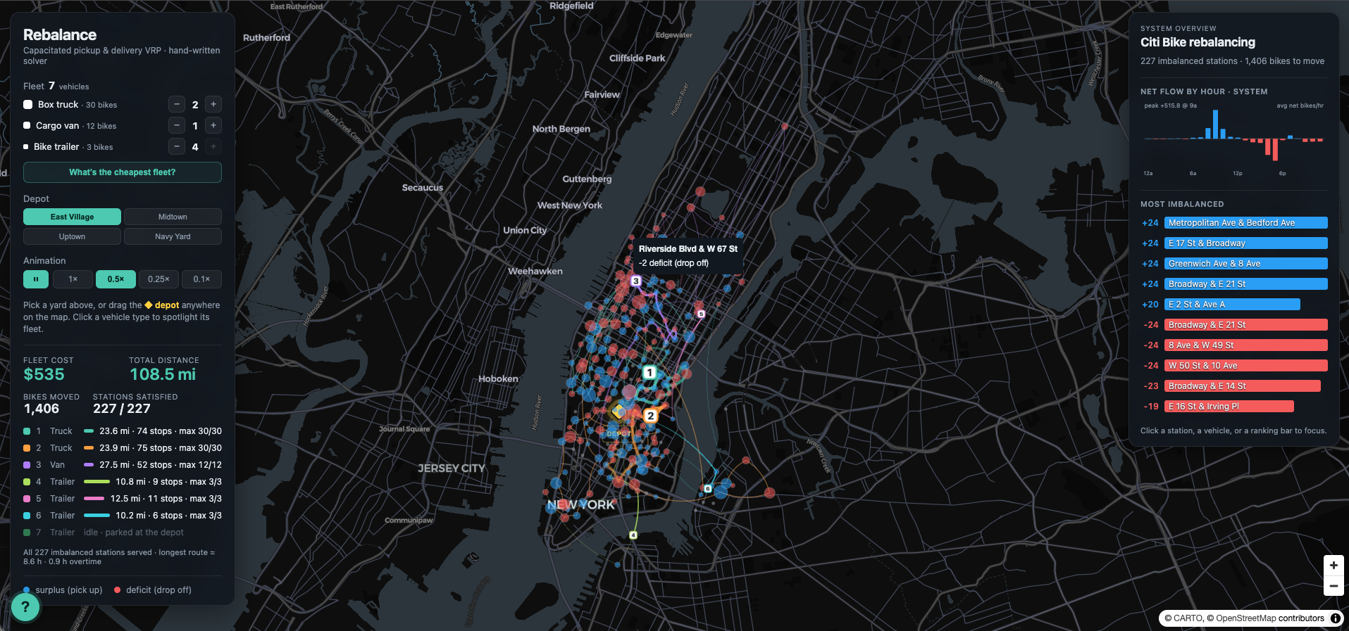
Rebalance is an interactive look at a real logistics problem: every night, bike-share operators send trucks to move bikes from stations that fill up to stations that run empty, so riders find a bike and an open dock in the morning. Using a day of real Citi Bike trip data for Manhattan, the tool derives each station's surplus or deficit from actual ride flows, then routes a fleet of trucks to rebalance the system. Everything runs in the browser: DuckDB-Wasm handles the data and distance work, and a hand-written solver does the optimization. Users can adjust the vehicle mix or let the fleet optimizer pick it, watch a truck fill and empty along its route, and click any station to see why it's imbalanced hour by hour. Built with Claude Code, with a routing solver written from scratch rather than handed off to an optimization API. This began as a Tableau dashboard on the same Citi Bike data, and that dashboard is still on Tableau Public. It answered what happened at each station: which ones filled, which ones emptied, when. The question worth answering was what to do about it, and a dashboard is the wrong artifact for that. Reformulated as a capacitated pickup-and-delivery routing problem, it became this.
The hard part wasn't drawing a map, it was solving the routing honestly. This is a capacitated pickup-and-delivery problem, a cousin of the traveling salesman problem, where trucks can't carry more bikes than they hold and a station's need has to be met without wasted driving. I wanted the optimizer to be genuinely mine rather than an off-the-shelf routing API, and I wanted it fast enough to re-solve live as the inputs change. Getting real, messy trip data into a shape the solver could use, and keeping the whole thing responsive in the browser, was the core difficulty.
I aggregated millions of raw trips down to a per-station net-flow signal in DuckDB, then wrote a cluster-first solver: k-means to assign stations to trucks, nearest-neighbor to seed each route, and 2-opt to refine it, all respecting truck capacity at every step. The solver runs in a Web Worker so the interface never freezes. DuckDB-Wasm computes the distance work in-browser, deck.gl and MapLibre render the routes and animation, and a load-profile chart exposes exactly why a truck's route loops back when it hits capacity. A fleet optimizer that solves all 104 vehicle mixes (up to 4 each of box truck, cargo van, and bike trailer, 8 total) and prices each one with a fixed dispatch cost per vehicle, a per-mile rate, and overtime past an 8-hour shift. Results plot cost against longest-route hours, exposing the tradeoff directly: a single box truck is cheap on paper until fifteen hours of overtime prices it out.
Full coverage of all 227 imbalanced stations at $535 across 108.5 miles, with a recommended fleet of two box trucks, one cargo van, and three bike trailers. The optimizer surfaces the real tradeoff rather than a single answer: three box trucks and one bike trailer cover the same ground with four vehicles for $19 more. A working demonstration of turning open data into a decision tool, with a hand-written solver rather than an optimization API.